In short: every reporting dashboard presents every number with the same visual confidence. A revenue figure from a freshly synced accrual ledger looks exactly like a cash balance from a bank connection that quietly stopped updating in May. Finrely’s Data Quality Score scores the difference across five pillars, reweights them depending on what you’re actually asking, and caps what you can claim about your own books until objective signals back you up. This page covers the model, the weights, and the thresholds.

A founder we talked with last quarter had a runway number she trusted enough to quote in a fundraising conversation. The number was wrong by about seven weeks of cash. Not because the math was broken, but because one of two bank connections had failed 41 days earlier and the dashboard kept drawing the same clean line with the same clean styling.
Nothing in the interface distinguished the live half of that number from the dead half.
That is the normal state of financial dashboards. They are extremely good at presentation and almost entirely silent about provenance. Every figure arrives in the same font, the same card, the same green-or-red treatment, regardless of whether it came from a ledger closed on the 5th of the month or from a source nobody has looked at since the spring.
Why “connected” is not the same as “trustworthy”
Most reporting tools do have some kind of data health indicator. Usually it is an integration status light: green if the API handshake worked, red if it didn’t.
That tells you the pipe is open. It says nothing about what is flowing through it.
A connection can be perfectly healthy and still feed you numbers you shouldn’t act on. Books kept on a cash basis will show a profitable month that was actually a month you collected two large old invoices. A chart of accounts with 40 percent of accounts unmapped produces totals that are complete-looking and short. An accounting system that syncs beautifully but hasn’t had a transaction posted in six weeks will hand you last quarter’s business, formatted as today’s. And a chart where every account is mapped can still put a cost on the right line for the tax return and the wrong one for running the business, which is why it pays to reconcile your management P&L with your books, account by account.
Status lights are integration monitoring wearing a finance costume. The question a CFO actually has is different: given how this data was produced, how much weight can I put on this specific number, for this specific decision?
The five pillars
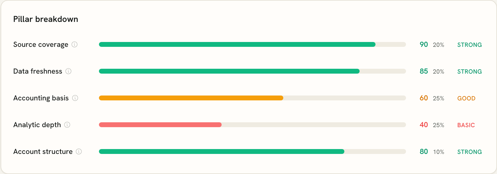
Finrely scores that question across five pillars. Each is scored 0-100 on its own, then combined into a single score with a label: Strong at 80 and above, Good from 55 to 79, Basic below 55.
Source coverage. Are the source types this kind of report needs actually connected? A profitability report needs accounting. A runway view needs banking. Connecting one and reporting on the other is the most common structural gap, and it is invisible in a normal dashboard because the report renders either way.
Data freshness. How many days since the last successful sync. This one is deliberately unforgiving: 3 days or fewer scores 100, a week scores 85, two weeks 70, a month 55, two months 35, three months 20. Past that it scores 5. There is no partial credit for a source that used to work.
Accounting basis. Are the books on an accrual basis and closed each month? This is the pillar that decides whether revenue and expense timing means anything. It is also the one Finrely cannot fix for you, and we say so directly in the product: Finrely reads your books, it does not edit them.
Analytic depth. Are expenses and revenue tagged to cost centers, business lines, or categories? Dimension coverage above 90 percent scores 100, above 70 percent scores 80, above 50 percent scores 60, and it drops fast below that. Under roughly 30 percent tagging, profit by business unit is not a report you can produce, it is a guess you can format.
Account structure. Are all accounts mapped to reporting lines, are the mappings confident rather than flagged, and are all bank accounts included? This one is scored as three parts internally: 60 percent mapping coverage, 20 percent mapping confidence, 20 percent bank completeness. Gaps here distort totals rather than breaking them, which is what makes them dangerous.
The part most scores get wrong: the weights are not fixed
Here is the design decision we think matters most, and the one that took the longest to get right.
A single blended data quality number is close to meaningless, because the pillars do not matter equally. They matter differently depending on the question you are asking the data.
If you are looking at runway, accrual discipline barely matters. You need banking coverage, current data, and confidence that every bank account is actually connected. If you are looking at profitability, the opposite is true: freshness matters somewhat, but accrual basis and dimension tagging are the whole game.
So the weights move with the scenario. The pillar scores stay the same, the weighting changes:
| Scenario | Source coverage | Freshness | Accounting basis | Analytic depth | Account structure |
|---|---|---|---|---|---|
| Default | 25% | 20% | 20% | 25% | 10% |
| Cash runway | 30% | 30% | 5% | 5% | 30% |
| Profitability | 20% | 15% | 25% | 30% | 10% |
| Board pack | 20% | 20% | 25% | 25% | 10% |
| Receivables | 25% | 25% | 25% | 15% | 10% |
Read the cash runway row against the profitability row. Accounting basis goes from 5 percent to 25 percent. Account structure goes from 30 percent to 10 percent. Same connected data, same underlying pillar scores, materially different answer to “can I trust this.”
That is not a cosmetic difference. A company with clean bank connections, complete bank coverage, and genuinely awful bookkeeping will score Strong for runway and Basic for profitability, and both of those are the correct answer. A single number would have averaged those into something that misleads you twice.
When no scenario is set explicitly, the score infers one from what you have connected. An accounting source implies profitability, a banking source implies cash runway.
Self-reported quality is capped, on purpose
During onboarding Finrely asks how your bookkeeping is kept. It’s a useful signal. It is also the single easiest thing in the whole system to answer optimistically, and almost everyone does.
So the self-report is capped. Saying your books are good and timely gets the accounting basis pillar to 60 out of 100 and no further. To go above that cap you need objective confirmation: an accounting source actually connected, and a close lag under 30 days.
The override runs in the other direction too. If the self-report says timely books but the close lag is over 60 days, the pillar scores 25 regardless of what was claimed, and a warning appears explaining exactly why: you reported timely bookkeeping, the close lag is N days, this pillar was scored on objective data.
The same logic applies to freshness. Report timely books, have a sync that is more than 90 days stale, and the score goes with the sync and tells you it did.
We debated softening this. We didn’t, and the reason is that a trust score you can talk your way past is worse than no trust score, because it manufactures confidence instead of measuring it.
What happens when the score is low
A number on its own is a judgment. Finrely tries to make it an instruction instead.
Any pillar below 80 produces a specific recommendation, ordered by which pillar is dragging hardest rather than by pillar number. The recommendations are scenario-aware, so a weak analytic depth pillar produces no recommendation at all under the cash runway scenario, because at 5 percent weight it would be noise dressed as advice.
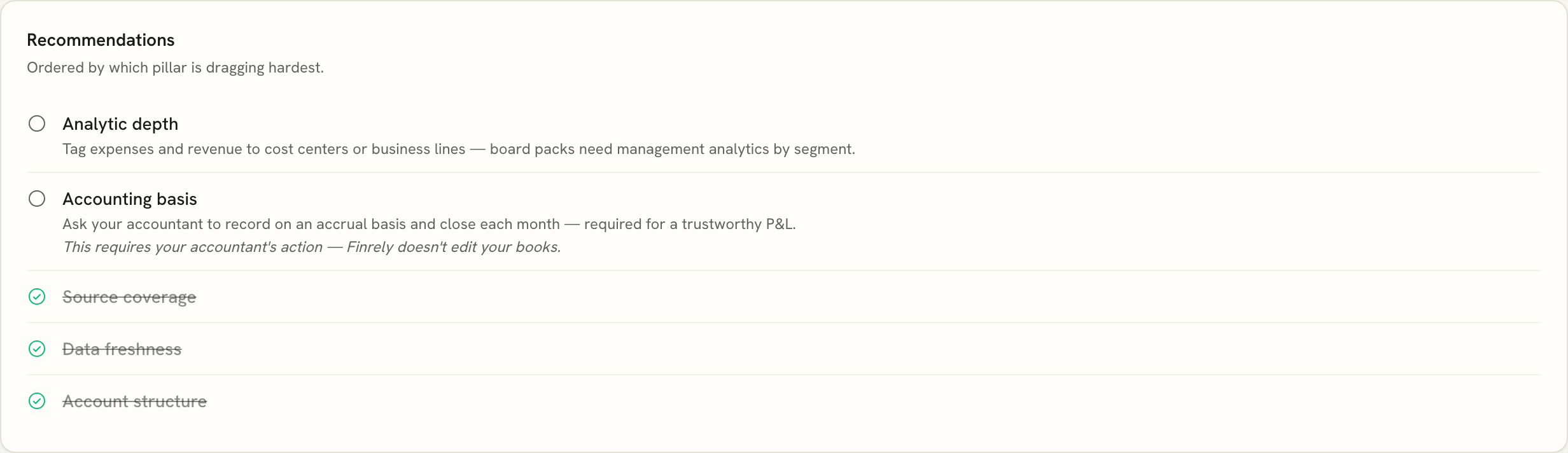
The wording is deliberately non-judgmental and points at the right person. Weak accounting basis returns something close to: ask your accountant to record on an accrual basis and close each month, and it carries an explicit note that this requires your accountant’s action because Finrely doesn’t edit your books. Weak freshness points at your bookkeeper, not at you.
The score also feeds the AI layer. When insights are generated, the model receives the score and the pillar breakdown as part of its input, with an instruction to say plainly when data quality is limited rather than producing a confident narrative over thin data. An AI that hedges when it should is more useful than one that never does.
What the score is not
Two honest limits, because a trust feature that oversells itself defeats its own purpose.
It does not audit your books. A well-maintained, freshly synced accrual ledger full of miscoded journal entries will score Strong and give you a wrong answer. The score measures the conditions under which a number would be reliable, not the number.
And it will annoy some people who deserve better. A small company with genuinely immaculate books, deliberately kept on a cash basis because that is appropriate for how they operate, with no cost center tagging because they have one business line, will not reach Strong. That is the model working as designed rather than a bug, and it is still the thing we get asked about most.
There’s also a category of problem the score doesn’t reach at all yet. Formal multi-entity consolidation with intercompany eliminations isn’t shipped in Finrely, so the score says nothing about consolidation correctness. If that’s your central problem, tools like Fathom and Syft are ahead of us there and we’d rather say so than imply otherwise.
Reading your own score in about a minute
The score sits in two places. A card on the dashboard shows the current score, the label, and the name of your weakest pillar. The dedicated Data Quality page shows all five pillars as scored bars with their current weights, the score history over time, the active warnings, and the ordered list of recommendations.
Three things to do with it:
Look at the weakest pillar first, not the headline number. The headline is an average and averages hide the specific thing that is wrong.
Check whether the active scenario matches the decision you are about to make. If you are about to talk to an investor about runway and the score is weighted for profitability, you are reading the wrong reliability number for that conversation.
Read the warnings before the recommendations. Warnings mean an objective signal contradicted a self-report, which usually points at something more structural than a missing tag.
The honest summary
Financial dashboards became very good at making numbers look authoritative long before they became good at telling you which ones deserve it. Scoring the conditions the data was produced under is not a complete answer to that, and it does not replace a close or an audit.
It does change the default. Instead of every figure carrying identical implied confidence, each one arrives with a stated basis, a weakest link, and a named next action. For a founder or a fractional CFO deciding how hard to lean on a number in front of a board, that is usually the difference that matters.
If you’re evaluating tools directly rather than just the scoring model, see how Finrely compares to Fathom and LiveFlow, or how source coverage stacks up across QuickBooks, Xero, Zoho Books, and Odoo.
FAQ
What is a data quality score in financial reporting?
It’s a measure of the conditions your numbers were produced under, not of whether the numbers are arithmetically correct. Finrely’s version scores five pillars - source coverage, data freshness, accounting basis, analytic depth, and account structure - weights them according to the question you’re asking, and returns a 0-100 score with a Basic, Good, or Strong label.
Why does the same company get a different data quality score for different reports?
Because the pillars matter unequally depending on the question. A runway forecast leans on banking coverage and freshness, so those carry 30 percent each. A profitability analysis leans on accrual basis and dimension tagging, so those carry 25 and 30 percent. The underlying pillar scores don’t change, the weights do.
Can you improve your score by saying your books are clean?
Not past 60 out of 100 on that pillar. Self-reported bookkeeping quality is capped until objective signals agree - an accounting source connected and a close lag under 30 days. If the self-report says timely books and the close lag is over 60 days, the score drops to 25 and a warning explains why.
What counts as fresh data?
Finrely scores freshness on days since the last successful sync: 3 days or fewer scores 100, a week scores 85, two weeks scores 70, a month scores 55, two months scores 35, three months scores 20, and anything beyond that scores 5.
Does a high data quality score mean the numbers are correct?
No. The score measures whether the conditions for a reliable number are in place. Bad journal entries inside a well-maintained, freshly synced accrual ledger will still produce a high score and a wrong answer. It narrows where to look, it doesn’t audit your books.
What does Finrely do with a low score?
Three things: it names the weakest pillar on the dashboard card, it generates specific actions ordered by which pillar is dragging hardest, and it passes the score into the AI insights layer so the AI states that its read is limited rather than answering with false confidence.
See what your own data scores. Connect a source in the live demo, or start free with no card required.
See it on your own numbers
Connect a source and watch a board-ready pack assemble itself - every figure traceable.